
Background
I am currently studying photography and we have different modules / courses. In the past, we already had portrait photography and fashion photography. And also many more.
But currently we are doing Architecture Photography. And I really like Architecture. I am really fascinated by Symmetry and Lines and I always try to integrate these compositions in my photography generally. And also, if I look at other people’s work, generally the architecture pictures that I like the most are mostly very symmetry heavy.
So I will try to explore some pictures and people and attempt to explain why I really like these projects or images. Also, I will show some of my pictures and explain what I like about my pictures or what I could have done better.
The Basics
First, it would probably be wise to just discuss the basics of Architecture Photography. What everyone would say is prob keep the lines straight. So no falling lines. And that the horizontals axils should be straight to give the image some order. Composition is also valuable in every genre of Photography, but I feel like it’s really essential to use it to your advantage in this genre. That you use the leading lines or symmetry of a building to your advantage. Also, depending on the assignment or rather if you have time to plan your shoot, you can also accordingly plan your picture. If it should be in the “golden hour” or really harsh shadows, or it could also be a night shot. But sometimes the time is limited and you just have to work with what you got.
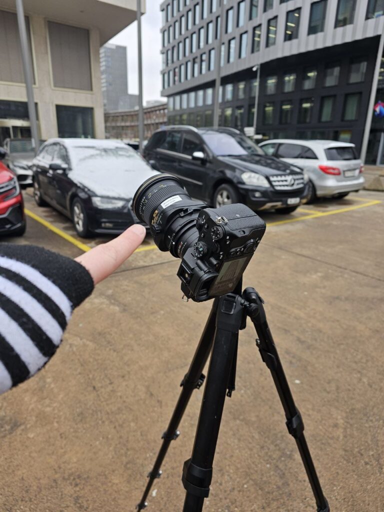
Also, for the best image quality most lenses are the sharpest from F8-F11. The ISO should be as low as possible. So that basically means you need a tripod.
More Advanced Stuff
What I really wasn’t aware of when I started to shoot architecture was that the camera with or without a tilt-shift lens should always be as straight as possible. So you won’t have to “fix” and crop the image due to the falling lines.
Also, in interior photography, it’s important to keep the camera as low as you can. You should be able to look on top of all the surfaces, like tables and commodes. But the camera shouldn’t be too high. Otherwise, it will look like all the furniture will fall off the picture. Consistency is also key. If you are making a picture series. The edit, aspect ratio should be deliberate and also make sense.
Additionally, you can (if you have the time and can plan your shoot or picture) control the shadows. So the buildings either get some texture or you can really see the shape of the building.
My Images
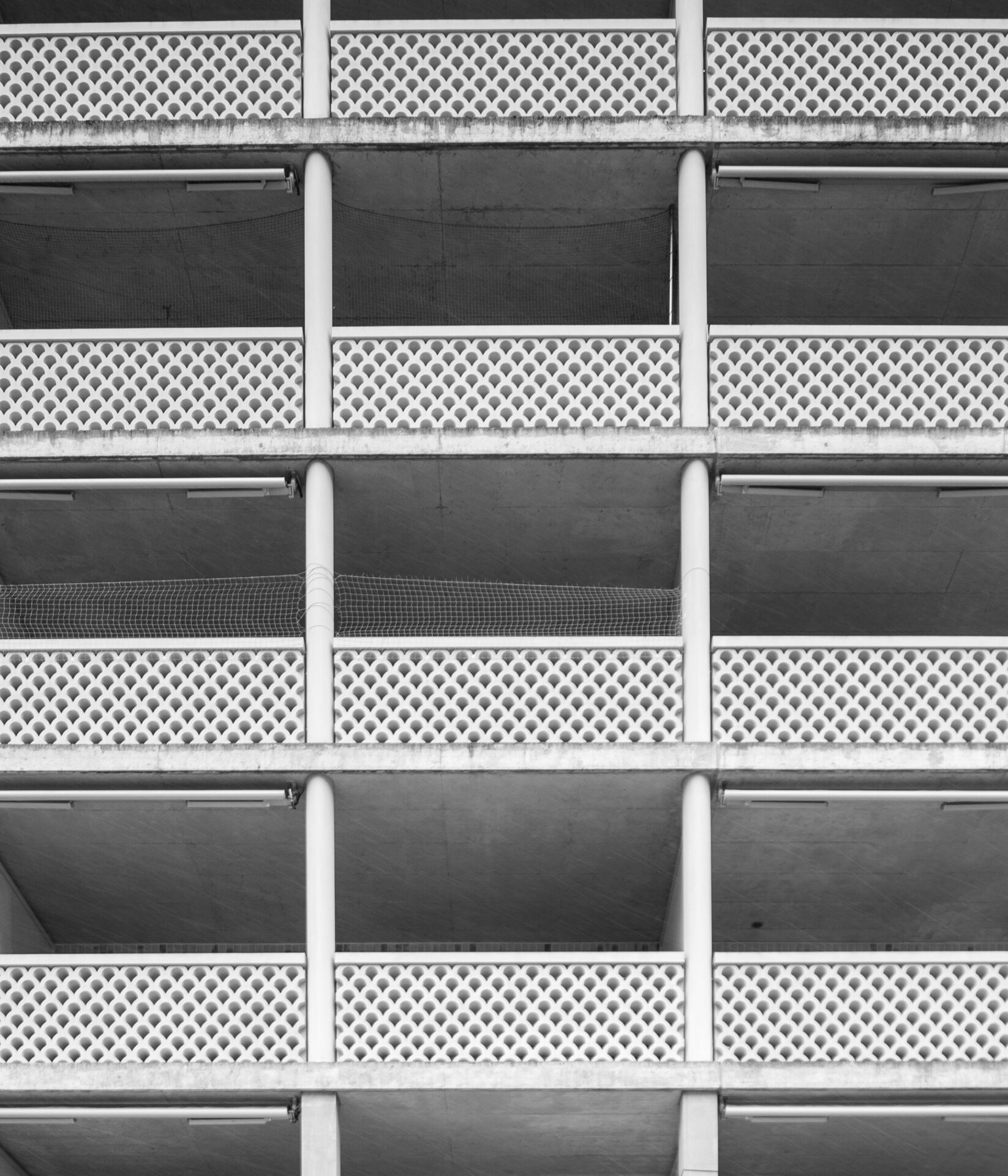
This series after I edited the “Balconies”, I decided, I would keep the whole series in black and white. In hindsight, all these images would also work great in color.
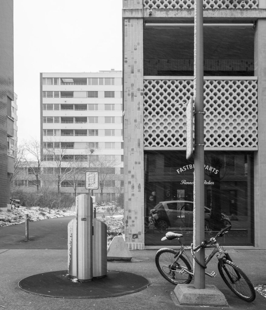
Here is what I would do different. First on the corner, I got the feedback that the color version of the image would prob work better than the black and white. Otherwise, the crop that I choose works great. The only thing that bothers me is the reflection of the car. So ideally, the car wouldn’t be there.
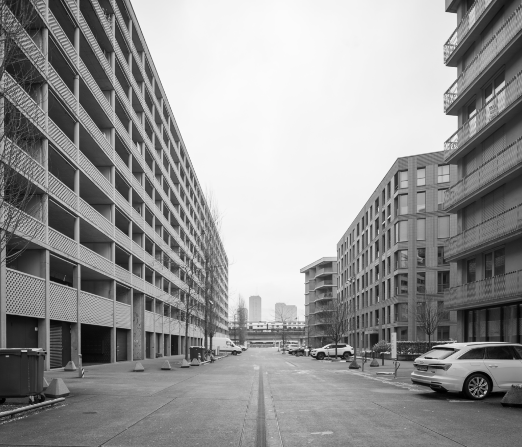
Then on the “Street” image, you have the issue that the tilt-shift lens is almost too wide, so you get distortions in the right corners. Also, the car on the bottom right is very bright. Either I could crop the image a bit, which would also fix the distortions, or you could tone it down by using the sliders in Lightroom. Because I feel that the car just steals away my attention and leads my eyes to the right corner.
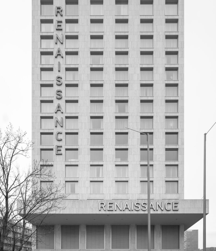
Originally, with this picture, I wanted to show the whole “Renaissance” Building. But, after I came home, I realized that this was simply not possible (with the pictures that I have captured). So I decided I would only show the lettering of the building. If I wanted to capture the whole building, I would have to move way further back, so I don’t have to tilt the camera upwards. Giving the image a bit more space on the bottom would also be nice. But otherwise, I really like how this series came out.
The last image would have also been great as a 1:1, but I also like it in this format (6:7). I just really like the symmetry and the repetitions. Maybe showing even more balconies could also be cool.

It’s a start; I just hope I won’t fail my exam hehe… ₍⑅ᐢ..ᐢ₎
(Also pls write me an E-Mail if you have some criticism or have some more tips about architecture photography)
Mail@faye.photography